Business signage takes numerous shapes and shares multiple purposes with one simple goal: to promote your business. Ranging from building-side banners to pylon signs, all of these types can help your company stand out, if you know how to use them effectively. So, here are the six most prevalent marketing signs to consider:
Contents
1.Feather Banners

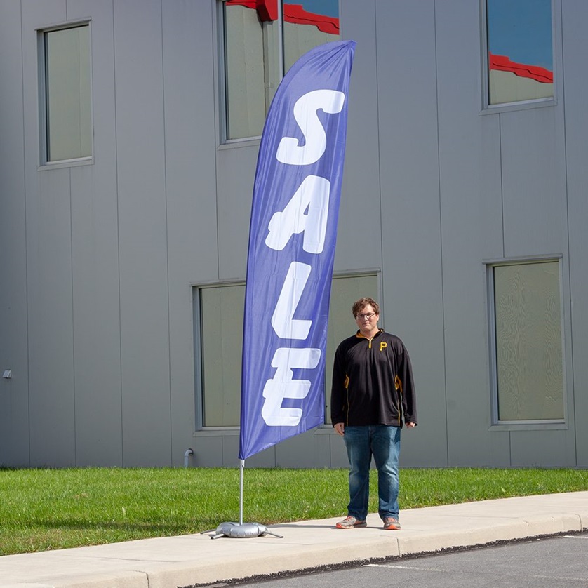
Often called feather signs or flags, these are popular outdoor advertising instruments. They are often made out of a vertical flag with a characteristic feather-like shape, which is frequently linked to a flexible pole. These banners are intended to attract attention and increase awareness for businesses, events, and promotions.
The feather banners are popular at trade exhibitions, outdoor events, and retail stores because of their portability and eye-catching style. They are fully customisable, allowing firms to display logos, slogans, or visuals to increase brand identification. The dynamic movement of feather flags in the wind adds to their efficiency at attracting attention.
2.Storefront Signage
Customers’ first impressions can be strongly influenced by storefront signage. Your sign should identify your company and its purpose. An excellent storefront sign will inform your consumers about what you do and clearly display your business name. If your company name does not accurately describe your products or services, graphics and logos might help potential clients understand what you have to offer and draw potential customers into your store.
3.Pylon Monument
If you want to be seen from afar, consider a pylon or monument sign in addition to your feather banner sign. Pylon signs are freestanding signage embedded in the ground. They are typically positioned away from your building or near the street. They have obvious supports that keep them secure. Most pylon signs are roughly 3.5 metres tall and come in a variety of widths. You want to ensure that these signages are visible from any distance.
Pylons and monument signs have similar appearances, yet they perform distinct functions. Pylons are taller than monument signs, and their purpose is to catch the attention of passing drivers. Monument signs, on the other hand, are designed with a more architectural appearance and display messages at eye level. Many monument signs stand at around five feet tall. Customers can identify the location of enterprises via pylon and monument signs. These signs are great for businesses located in back lots or a hidden driveway.
4.Awnings
Custom awnings can transform your store’s appearance and attract customers. You can use them to supplement your present storefront signs and as an additional marketing tool to promote your business. They also give your store a facelift and increase its appeal to onlookers. Furthermore, they enhance existing storefront signs and add a new marketing component. During the warmer months, they provide additional seating for restaurants and cafes.
5.Vehicle Graphics
Advertising your business on the side of a van or automobile is an efficient approach to increase brand recognition. You can choose between little decals and huge images that cover the vehicle with slogans and eye-catching visuals. Advertising your business on automobiles effectively increases brand recognition and provides a variety of alternatives, from small decals to enlarged, eye-catching images. There are so many inventive ways here to spread the message as the vehicle moves through various neighbourhood or cities.
6.Interior Signs
Interior signage is an efficient approach to greet customers and increase brand awareness. The signs come in a variety of sizes and designs made to fit perfectly with your already existing office furniture and décor. Interior signs may include reception area signage, wayfinding markers, and directories. They are useful for promoting your business and making the space more appealing.
Quick Tips for Making Your Signage Effective

Keep It Simple
Avoid using excessive text and photos, which will confuse your clients. To create an appealing design, allow enough of “white space” surrounding your design elements. To minimise poor signage design, use shorter sentences, eliminate extraneous words and phrases, and remove duplicate text.
Make It Easier to Read and View
Shop signage is used to assist customers find your business. Make sure the signs you select are easy to read. If you want these signs to be visible from a long distance, make sure they are large enough for everyone to notice.
Create a Memorable and Unique Design
Attractive photos and logos can enhance the visual attractiveness of your sign. They can also help explain the nature of your company and promote your brand. Choose colours that evoke specific emotions or feelings for your business store signs to attract passing traffic. For example, red and yellow are wonderful colours for fast food businesses since they thrill and make customers hungry. In contrast, blue is a good colour for a bank or other financial organisation since it offers customers a sense of professionalism.


